Tools are important. They’re not as important as people often think (give Rembrandt a set of crayons and he could still produce a masterpiece; ditto a great musician with a sub-par instrument), but they do make a difference. Every professional ends up developing a certain set of preferences over the years: tricks, shortcuts, and idiosyncrasies that allow them to produce their work as efficiently as possible. So I thought it would be fun to show you how I go about setting up Microsoft Word for writing.
Just a note: I work on a Mac. Most of what follows should apply to both PC and Mac versions of Word, but there may be some differences from one platform to another.
Word is a huge, gangly, unwieldy monster of program, but it does have one great advantage: every part of it can be customized. If you want to have ten different windows and toolbars open at all times, you can do that. If you want to strip down the program to a bare-bones writing experience, you can do that too. I tend to strike a balance between those two approaches.
First things first. Go to Word > Preferences > General and select “Blue background, white text.” Why? Because for long stretches of reading, white text on blue produces less eye strain than the usual black text on white. When I first switched over, I found the new look weird, but now I can’t do without it. The only downside is that the blue light can keep you up at night. If this is a problem for you, I recommend using a program like f.lux that strips the blue light from your monitor after sunset. Doing this can make a big difference in your sleep quality.
If you use the blue background, you’ll probably need to change the color your computer uses when highlighting text. I like yellow. On a Mac, go to your System Preferences > General and choose a new highlight color.
Next in Word: Format > Font. Select a font and font size and then click on “Default”. This sets your default font for all new documents. I use Times New Roman 12 point. It’s not a great font for reading on the page, but it looks good on the screen.
Now, select your whole document (Command + A) and then go to Format > Paragraph and under the “Indentation” category click on the menu labeled “Special.” Select “First line” and set this to “0.25”. This gives you a perfect quarter-inch indent at the beginning of each new paragraph whenever you hit return. Doing this saves a lot of time. Also, make sure the line spacing is set to single. There’s no need for double line spacing unless you’re editing.
Then: Format > Document. Here, give yourself 2 inch margins on the left and the right. Human eyes have difficulty with lines that are more than 2.5 alphabets wide. This also gives you a better idea of what your manuscript will look like when actually published. Plus it makes your book seem a lot longer, so a win all around.
Okay. That’s the easy stuff. You could stop here, but we’re writers! We never make things easy!
The big question now is whether to use the ribbon or whether to use a toolbar. The ribbon is the collapsible bar at the top of your document where you can find lots of common commands arranged under different tabs. This is convenient, but it’s difficult if not impossible to customize—depending on which version of Word you’re using—it chews up valuable screen space above your text (even when collapsed), and it remains attached to your document at all times, which can be annoying if you’re editing multiple documents at once and that spell checking button keeps ending up in a different place. . . .
A toolbar can provide many of the same functions as the ribbon, but without needing to click through tabs. Also, it can be detached from your document, so that all of your favorite commands remain in the same spot on the screen at all times. (Yes, I’m a stickler for consistency in my working environment.) Plus, a toolbar is easier to customize than the ribbon. The downsides? You can’t collapse a toolbar, and it won’t give you access to styles (more on styles later).
If you want to remove the ribbon, go to Word > Preferences > Ribbon and uncheck “Turn on the ribbon.”
And if you want to use a toolbar, I recommend the formatting one. View > Toolbars > Formatting. Like so:

You can then customize this through View > Toolbars > Customize Toolbars and Menus. . . Make sure the formatting toolbar is selected and then deselect the “dock” option, if you want the bar to remain detached from your document. Next, go to the “Commands” tab on the right and click and drag the commands you want up onto the toolbar. (You can remove commands in the same way.)
As for myself, I alternate between using the ribbon and using a toolbar. If I need to employ styles or track changes, I bring up the ribbon. Aside from that, I keep the ribbon turned off and rely upon my personalized toolbar, which I also keep hidden most of the time.
Speaking of track changes, it’s a powerful tool that can be frustrating if you aren’t familiar with it. One thing that I’ve found helpful is to program in a key-command that allows me to hide or show the markup at will. That way I can just concentrate on the text (usually if I’m having to add or rewrite something) or I can look at the text + markup, all at the push of a few buttons.
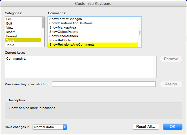
Word has a bunch of key commands already programmed in, so it wasn’t easy to find one I could appropriate for this use. In the end I settled on Command + L. You can program this by going to Tools > Customize Keyboard > Tools and select “Show Revisions And Comments.” Like so:
Also, under Tools > Customize Keyboard > Insert, I bound “Insert Annotations” to Command + Option + A. This lets me insert a comment into track changes without having to go through a menu. This saves a lot of time when working on a large manuscript.
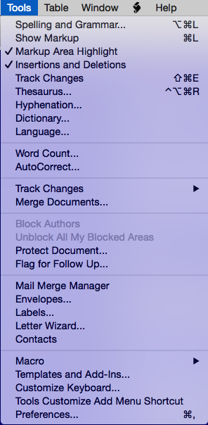
The last tweak I made regarding track changes was to go View > Toolbars > Customize Toolbars and Menus and there add the following commands to the Tools drop down menu: Show Markup, Markup Area Highlighted, Insertions and Deletions, Track Changes. When I finished, the menu looked like this:
Whew! Are we done yet? Not quite, but almost! One last thing to do. Styles!
Why styles? You don’t have to use them. I went decades without paying them the slightest attention. That changed a few years ago when I ended up sitting next to Brandon Sanderson on a flight to San Diego Comic-Con. Brandon ended up totally blowing my mind with what he taught me about styles.
And now I’m going to teach you!
So, on the ribbon, under the Home tab, you’ll see the box of included styles. “Normal” is your default font and font size. This is the style you should have applied to the main body of your work. However, there are all those other styles sitting there forlorn and forgotten.
Either right click on any style other than Normal and select “Modify” or go View > Styles and bring up the Styles window. If you bring up the window, click “New Style” and create one with the name Chapter.
Give the Chapter style whatever font and size you want: Trajan, Adobe Garamond, or even Comic Sans 34 point!
Then create two more styles and name them Section and Sub-chapter respectively (you can make more if you need).
Now here’s how you use them: Apply the Section style to large section breaks in your book, the Chapter style to the names of your chapters, and the Sub-chapter style(s) to any breaks within your chapters. Why?
BECAUSE IT’S AWESOME!
No, seriously. Awesome. Word has the ability to use the styles applied to a document to 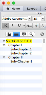 create a navigable document map. This would have saved me sooo much time when editing the Inheritance Cycle. You can bring this up by either going to View > Sidebar > Document Map Pane or by going Command + F and then selecting the Document Map tab at the top of the sidebar window. In some versions of Word, you can even click and drag the different chunks in the document map, which is great if you’re having to reorganize your manuscript.
One last note: when creating a new chapter or section, it’s important to insert a page break: Insert > Break > Page Break. That way, no matter how much text you add before the chapter, the chapter title will always appear at the top of a page.
And that’s how I customize MS Word. I realize that my methods might not work for everyone, but perhaps they’ll give you a few ideas for ways to make your own writing experience easier.